| INDEX | 1300-1599 | 1600s | 1700s | 1800s | 1900s | CROSS-ERA | ETHNO | |
| MISCELLANY | CONTACT | SEARCH | |
Colour and pattern are each complex enough to each fill a page of their own, but they're too interconnected to separate them.
2. Colours and Patterns— you are here
 |
|
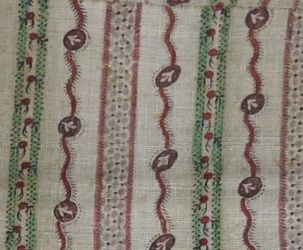
Roller-printed linen, late 18th century |
 |
|
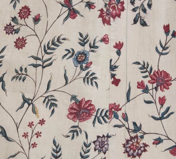
Block-printed cotton, late 18th century |
Colours are a complex matter for multiple reasons:
In order to find out which colours to choose and which to avoid if you aim at a credible 18th century representation, you need to take into account the technological possibilities of early dyeing on one hand, and fashion on the other. This means that if it was possible to dye caramel blue, and if you manage to find a painting or extant item showing that colour, it doesn't necessarily mean that caramel blue was a popular colour. It's quite possible that the extant item only survived because the original owner liked the colour, but her contemporaries ridiculed for it, so she buried it in the farthest corner of the attic.(survival bias) So we would have to find some more examples of the colour before we can assume with any certainty that it was fashionable, or at least common, at the time.
Up until the mid-19th century, plant and some animal-based dyes were the only ones available. In the 18th century, the art of dyeing, like so many other crafts, was at its technological peak. Professional dyers were able to achieve a wide variety of colours, at least on silk and wool, but not the intense, gaudy hues that chemical dyes made possible. The popularity of "Scheele's green", "electric blue" and vivid purple during the 19th century gives us a pretty good idea of which colours had been out of range before the invention of chemical dyes.
While dyeing plant-based fibres such as flax (linen), cotton or hemp with natural dyes was possible, saturated hues required much more effort than dyeing animal-based protein fibres. Turkish red was particularly sought after: A vibrant red dyed with madder on linen or cotton, using a 26-day preparation process that the Turks kept secret.2 Dyeing cellulose fibres did not only take more time, but also more mordants, more water, more fuel (because most mordanting and dyeing processes use hot water) more dyestuff and more care and know-how. All of those items add to the cost of colourful linen and cotton fabrics.
Cost-wise, a darker dye is more expensive than a light one (more dyestuff needed), one that requires two dye baths (blue+yellow=green) more than a one-bath colour, imported dyestuffs more than home-grown ones. Colourfast black was dyed in three consecutive baths, each containing a high concentration of dyestuff, which made it one of the most expensive "colours".
We know that wool and flax, being home-grown in Europe, were the
cheapest fibres, thus readily available to the lower to middling sort. One of
them is the most difficult to dye fibre, the other, the easiest to dye. There
are only two types of dyes that linen is easy to dye with: Indigo (blue), because
it is a vat dye, i.e. chemically different from other dyes, and anything rich
in tannins, such as walnut husks (brown), tree barks (brown) or oak galls (grey-brown).
If you were poor, those were the linen colours available to you. Acually, blue
and brown are the only colours that have so far been found documented as solid
colours on linen or cotton. All other colours appear as stripes, checks or figured
prints, but not as solid all-over colour.
For wool, on the other hand, a varied palette was available, some even using
domestically grown plants: Yellow and olive from every other weed, red, purple
and orange from madder, blue from woad, and ouf course browns and greys.
The upshot of all this is that the likeliest combinations for cheap workday clothing are natural, partly bleached, brown and blue linen and undyed, yellow and olive wool3. For Sundays and holidays, or everyday clothing of the middle class, add wool in red, blue, green and even black. Clothing in general was quite expensive, so the lower and middle classes expected it to be long-lasting, and current fashion did not play much of a role for colour choice.
For wealthy people, almost anything was possible, especially since they seem to have avoided the hard-to-dye linen except for undergarments (white). Silk takes all dyes beautifully, and the cost of the (imported) fibre overshadows the price of dyestuffs and the dyeing process. Almost all colours can be seen in contemporary portraiture, although some are rarer than others and, as stated above, paintings are not 100% credible,. For reenactment purposes, I would stay away from orange, dark purple, hot pink, spring green as a main colour. Basically from anthing that only occurs in one to three paintings and/or surviving garments, because it's not just a question of whether it existed at all, but also of whether it's representative of the era.
The ladies seem to have tended towards pale colours such as silver, ivory, pale blue, blue-grey, pale pink, although it's hard to quantify, and it's really not much more than a tendency. We do see vibrant, deep colours as well: red, dark blue, leafy green, egg-yolk yellow, chocolate brown... and even complimentary colour combinations such as red and green. Their frequency, especially of darker hues as the main colour, increases as the century wears on. Men dressed every bit as colourfully as women, with a tendency towards more muted, darker colours.
Black had special meanings, similar to today: mourning, but also seriousness and austerity. The latter is probably why we see it more on men than on women, because women are never serious, right? Sure. You see black on widows, but also for fancy ball robes for women, priests and scholars (including those who wanted to be seen as scholars) for men, but also on wealthy farmers and artisans.
Those of us who strive to re-create 18th century clothing are drawn towards patterned fabrics in the beginning, thinking floral patterns to be the most typical. And yes, floral patterns were pouplar, but like with colours, one had to be able to afford it. Every technique that could produce a pattern relied on manual labour and thus, raised the price of the fabric. In portraits, we mostly see rich people for whom being painted in a terribly expensive brocade garment was a status symbol. In museums, we mostly see garments that were treasued family heirlooms on account of their beauty and monetary value.4 For living history as well as the performing arts, a garment made of solid-coloured taffeta with self-fabric trim, or even no trim at all, is much more authentic than something with a wrong pattern. Identifying the "right" patterns takes a lot of training.
As with colours, we first have to be clear which fibre we're dealing with, and which pattern technique: A pattern can be woven, embroidered, printed or painted. A woven pattern can emerge from a simple weave by alternating colours in the warp or weft (stripes) or both warp and weft (check), be the result of a twill weave (uniform, geometric overall pattern, e.g. herringbone), or result from a complex weaving technique such as damask or lampas. Only the latter ones produce floral or otherwise figured patterns.
Not all methods of producing patterns were used on all fibres. As a rule of thumb, cheaper techniques went with cheaper fibres, although there is one rather surprising exception. In addition to the fibre (its cost as well as ease of dyeing), the purpose of the fabric also plays an important role: If you've found a swatch in an extant fabric collection you still don't know what it was destined to become: It could be clothing (but fashion or undergarment?), table linen, curtains, matress ticking, or even sacking. The following table doesn't really give credit to the complexity of the matter. I have debated on whether to include non-clothing examples and decided to do so, but only in a few select cases that I have not found any clothing examples for, but ample documentation that the fibre/pattern combo existed.
| Linen | Cotton | Wool | Silk | |
| solid (plain or twill weave) | white, natural, brown, blue | white, for caps, kerchiefs and underwear, later chemise dresses | yes, all colours | yes, all colours |
| striped (woven) | mostly red/white, blue/white, blue/white/red, for aprons, household textiles, petticoats and waistcoats | see linen | yes, all colours | yes, all colours |
| check5 (woven) | see striped | see linen | only in Scotland so far, rare | yes |
| geometric (fancy twill weave) | household textiles, rarely lining and work clothes, usually one colour | probably same as linen | no | Not really. There are examples of geometric patterns, but they are technically closer to damask |
| floral, printed | rare, mostly just one colour (blue, brown, black) on white | chintzes, usually in different hues of red (including orange and purple), blue, green, yellow. | no | no |
| floral, woven | only table textiles (white-on-white damask) | no | yes,as damask and brocade | yes |
| floral, embroidered | crewel (i.e. wool), rarely silk embroidery threads, for limited uses (e.g. pocketbooks, under-petticoats, house caps, rarely outer garments) | no? | no | yes, but adapted the seam lines, not as overall pattern |
| floral, painted | rare | rarely, same colours and patterns as printed chintz | no | yes, on pale ground fabric, probably often using pigments rather than dye |
The most obvious and affordable patterning technique is alternating coloured threads in either weft or weave (stripes) or both (check) while using the simplest weave structure, plain weave. In linen and cotton fabrics, the main colour is usually white, probably because it kept the dyeing costs low. Colourful stripes (i.e. not just mostly white with red and blue) are found in linsey-woolsey (weft stripes of wool on linen warp) and calimanco (warp stripes, all worsted wool). Patterns created by variations of twill weave (e.g. herringbone, diamond twill, diaper) seem to have been mostly used for household goods, although diaper sometimes is mentioned for petticoats (probably under-petticoats, but the sources don't say). Striped fabrics are used for outer garments more often than checks, no matter what the fibre.
Non-woven patterns in cotton were block-printed, very rarely hand-painted (the few examples look exactly like the prints of the time). At the very end of the century, in the 1790s, roller-printing was introduced, with very small vertical repeats (due to the circumference of the roller) and a little wider horizontal ones (=width of the roller).
It takes rather a lot of research to get a feel for what pattern works for which era – not just which pattern works for the 19th century rather than the 18th, but also which pattern works for the 1730s and which for the 1780s. And again, there is a difference depending on which fibre you're looking at. I've looked at lots of chintzes and still have trouble matching them to a decade. I believe that's because they were a lot cheaper than patterned silk fabrics, so they were affordable for, and marketed to, middle-class people who could not, however, afford to switch out garments every few years just to follow the newest fashion. (You can change the shape of a garment to fit a new trend, but you can't change the fabric.7) The print patterns for chintzes seem to not have followed the fashions for woven silk patterns at the same pace. It makes sense, too: A silk manufacturer could change the pattern every time the loom received a new warp, but the printer had to use the printing stamps until they'd worn out.
One can, however, rule out a lot of fabrics by looking at the colours used. 18th century chintzes leveraged the fact that madder produces different hues of red with different mordants. Mordants are chemicals (metal salts) that bind the dye to the fibre permanently. Depending on the mordant, madder can produce red, pink, orange, purple, and something close to black. In those areas of the fabric that had not been treated with mordant, the colours could be washed out. Blue, green and yellow were added later. Here's a video by the Metropolitan Museum of Art showing how chitzes were dyed. It will show you what colours were attainable and why. Authentic chintzes are hard to get by nowadays; Colonial Williamsburg and Dutchfabric are the only two sources I know, and both offer colourways that are not authentic, so you still can't rely on that what they offer must be "right".
There is one other type of printed cotton fabric that I need to caution against: Toile de Jouy. It is authentic in that it was first created in mid-18th century France, and printed on cotton. However, those fabrics were intended for furnishing, not clothing. There are one or two garments printed with patterns that resemble Toile de Jouy, and may even be made from Toile de Jouy, but as I said above: Just because it was technically possible doesn't mean it's representative of the era.
Silk patterns were, with a few exceptions, woven. The surviving painted examples are identified by museums as Indian or Chinese in origin but made for the European market6. Both the main techniques – damask and lampas – required a lot of work both in preparation and in weaving. The striped and checked linens and cottons could be woven "at home" by part-time farmers, but creating damask and lampas involved specialised artisans even in the preparation of the loom, and draw-boys to assist the weaver. The yarns used were of the highest grade; brocading used un-twisted filament silk, the most expensive kind. The looms were highly complex mechanisms that no weaver could afford to own. Patterned silk fabrics were, therefore, made in factory-like workshops. Those workshops also employed fabric designers whose designs have sometimes survived on paper8. Silk fabric patterns are, therefore, relatively easy to date – with some training.
And finally, wool. It was almost exclusively made into solid-coloured fabrics, plain or simple twill weave, with the exception of linsey-woolsey and calimanco, as mentioned above. With two notable exceptions: Calimanco, a worsted fabric which could come as a solid-colour satin, striped, or as figured damask, and multi-colured wool brocade. See The Calimanco Project for more on that.
1) "la notte bruna", the 'brown' night, in the lyrics
of Monteverdi's "l'Orfeo", 1608
2) Vollständiges Färbe- und Blaichbuch zu mehrem Unterricht, Nutzen
und Gebrauch für Fabrikanten und Färber. Ulm: August Lebrecht Stettin,
1780. Available on Google Books.
3) Unless the clothing was bought used, but even then, colourful used clothing
would probably have been reserved for "better" occasions.
4) This is called conservation bias: some artifacts are more likely to survive
than others. For the same reason you sometimes hear that "people were smaller
back then": Tiny garments couldn't be handed down, altered or abused as
fancy dress, so they survived.
5) Native speakers of English have tried to explain to me the differences beween
check, plaid and crossbar. Their lack of success was due in part to their not
being all that sure themselves, to variations within English usages, and to
a great part to the fact that German doesn't differentiate. It's like explaining
the difference between R and L, or between blue and green, to a Japanese person.
6) e.g. Historical Fashion in Detail, p 66
7) I think that maybe one of the problems in dating a chintz is that even museum
scholars have to rely on comparative dating, i.e. if a robe can be dated to
1750 by its style, the fabric pattern also gets tagged as 1750, even though
it may be 1720.
8) Silk Designs of the Eighteenth Century, Londoon: V&A, 1996
Content, layout and images of this page
and any sub-page of the domains marquise.de, contouche.de,
lumieres.de, manteau.de and costumebase.org are copyright (c) 1997-2022 by Alexa Bender. All rights
reserved. See Copyright Page.

GDPO


This work is licensed under a Creative Commons License.